Apparently, both Kristjan Uba and me were toying with the idea of visualization and wondering how to use it communicate different aspects of testing and its results. Therefore, we quickly came to the agreement that the topic of the next peer conference should be visualization. We also agreed that this should be a practical workshop where something could be tried out instead of coming with a prepared presentation. The reason behind it was that well… I have done little of it and do it selectively; pretty much the same applies to Kristjan.
I hosted the event at my office where we gathered on the morning of April 26. Participants at PEST 4.5:
- Kristjan Uba
- Oliver Vilson
- Rudolf Elbrecht
- Kadri-Annagret Petersen (newcomer!)
- me
We had some last minute cancellations as well.
Kristjan did the necessary introductions and explained the four tasks he wanted solutions for in visual form:
- Feature/area vs bugs/severity (how to show you have major and minor bugs in different areas of the product/system under test)
- Test coverage in different areas throughout iterations
- New features vs risks/bugs
- Status of the project/product overall
For bugs, he specified the following kinds:
- “obviously major” bugs
- important but can wait until next release to be fixed
- “stupid bugs” that happen once every full moon
- a lot of small things
We also had an imaginary project: electric bicycle for Dakar rally with all sorts of awesome features (just to prime our brains and have something tangible to start with).
Everybody picked a topic, grabbed the coloring pens and papers and got to work. Afterwards everyone explained what they did, then questions were asked, comments made. You know, the regular peer conference stuff. Since the group was so small, we didn’t use the cards to moderate discussions.
I picked the first task. Here’s how I went about it.
Attempt 1
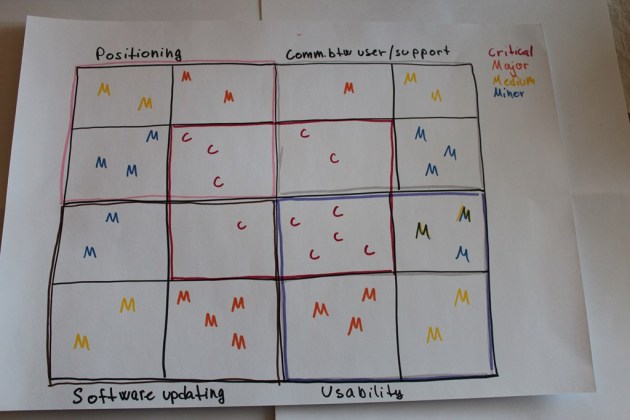
I imagined boxes. Structure. Here’s the result:
There were four areas of importance to my electric bicycle, so I each of the large quadrants is an area. Each of them is divided in 4 by severity of the bugs. There’s color coding: each severity has a corresponding color and my idea was that visualizing the clusters of bugs would be helped by colors. The letters are just placeholders: in real life there could by bug titles as hyperlinks or some kind of tags or other useful names.
For whatever reason, it seemed like it makes sense to have the critical bugs in the centre to make sure their clustering would catch everyone’s eye. But then again… what about the clustering of minor issues? This wouldn’t be as clear… which is why I changed tactics in the second attempt.
Attempt 2
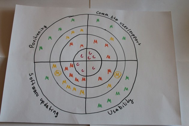
I still went for a central cluster but thought of it more in terms of a bull’s eye.
You may throw arrows at it and fix the bugs you pierce through 😛
Anyway, now I got some concentric rings. The good thing is that it’s easier to compare the bugs and their amount between areas. But then again you’d need to zoom in to the critical area because there may be too many and it won’t show up well. Also, the minor bugs at the edges may get less attention which is why Oliver suggested that in this model you could reverse the order and cluster the small ones in the centre to get attention.
You may notice some bugs have special marking: a circle around them. I used the severities I use daily: critical, major, medium, minor. But then I remembered Kristjan’s “stupid bugs” (see above) and decided that it may be worth marking those special cases while keeping their severity as is.
Attempt 3
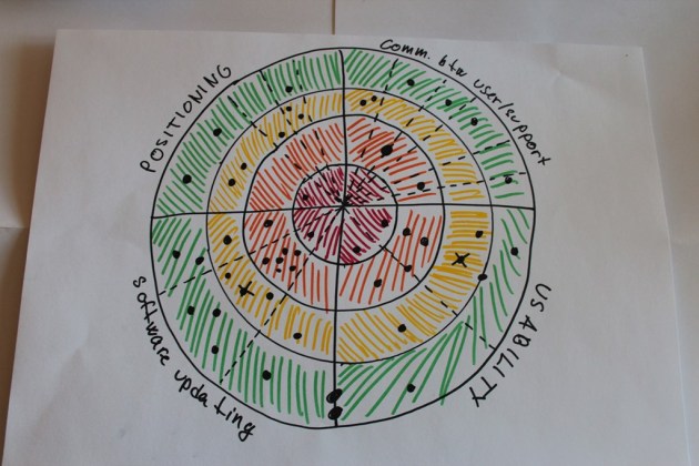
Then I felt there was too little color… What about making it stronger?
I used the same model but changed the means. Now color was in the background but bugs were spots. When I was working on it, new ideas spawned (or dawned on me):
- and area could be broken down into sub-areas if there are some that are worth paying attention to. So the dotted lines represents breakdowns of an area.
- I accidentally drew some bugs where I drew the dotted line but then it dawned on me that oh, I may have to show bugs that are between areas. Of course, there is a difficult limitation: you can only show “integration” bugs between areas that are side by side in your model already. But as we found out during the workshop, such relationships are hard to show.
- You notice some spots are bigger than others… which is where I started playing with a new idea which I realized in attempt 4.
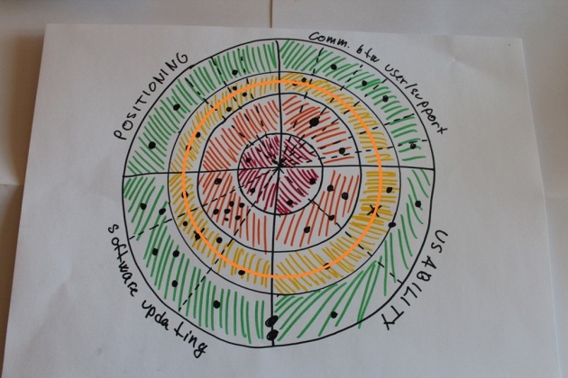
During the discussion, Kristjan pointed out that one good thing in this model is that we can place the release criteria into it. That’s pretty much what he meant:
The release criterion is simple: if there is anything inside the orange circle, we won’t release. Stuff outside is something we can live with. A clear goal emerges: let’s clean up the bull’s eye and its neighbouring areas.
Attempt 4
I guess I was getting more abstract now… There were jokes about who can spot a constellation 🙂
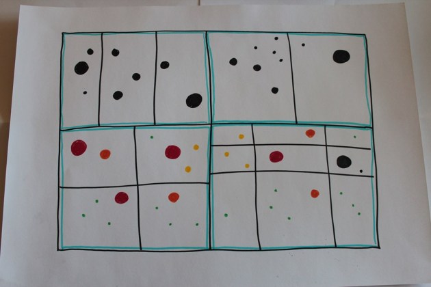
I did return to my original structure but modified it. This visualization of bugs in 4 areas is meant to experiment with the following ideas:
- size of the dot as the indication of severity
- different sizes color coded vs without color coding
- 4 areas divided into sub-areas
- each sub-area gets its bug count but the whole status can be deduced by looking at this area (and comparing it with others if needed).
Somehow I avoided numbers and counts of bugs in my models. Others did use numbers and I think it is alright. But my brain was wired to create pictures of bugs, their whereabouts and importance for quick assessment. The details would have to be discussed if there is a need. But if you just want to know what’s going on… you don’t details at first.
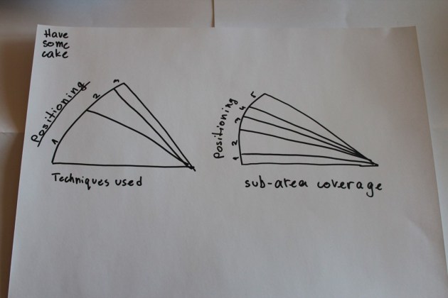
I had the annoying thought of coverage that become harder and harder to suppress. Because hey… it is important if I found critical showstoppers in the first few tests which means the rest of the area is not covered or if I found them after having covered some ground already. So I just drew two slices of cake (I may have been getting hungry).
The slice on the left is a sketch of showing what kind of test techniques were used. Maybe I used a lot of scenarios but didn’t focus on the data as much.
The slice on the right does a bad job but it was meant to communicate a hazy idea: the thickness of the slice would indicate how much of something was covered. The problem is obvious: the size of the slice itself is fixed and I don’t know how big exactly the “whole slice” is anyway.
Afterwards I realized that my visualizations were quite abstract, more like proofs of concept. But that’s okay: I have been thinking that I should try something for a loooong time but still haven’t. So this workshop was great for me to actually get visualizing and thinking about the problems. I got some good ideas from other participants but I’ll comment on those once they’ve summarized their ideas (hopefully, it will be soon-ish).
Before we wrapped up, Kristjan showed how he has tried to do some visualization and add colors to help with understanding. I definitely want to steal some ideas from how he has worked with test results to report them. He said that well, it’s not much visualization but some of the things he had I hadn’t really thought about even. Awesome!
All in all, PEST 4.5 was short and sweet and very useful. Looking forward to the next one!

Pingback: Summary of my presentation at PEST 4.5 | Notes to Self
Pingback: Reporting Risks to Business: First Steps from Trying to Delivering (The Better Late Than Never Edition) | The Pain and Gain of Edward Bear